Showing posts with label buildings. Show all posts

Friday, December 3, 2010

Building Materials...

As I've mentioned, I enjoy church architecture.  If I could choose any corner of the architecture field, it would be designing churches, libraries, schools, community centers: useful multipurpose places where people gather.  These buildings enrich our lives, if you think about it.  They are also the kinds of buildings that are given a lot of free rein to be creative in design.  Sometimes this is a good thing, sometimes this is a bad thing.  I showed an example of wonderful church architecture before, St. Ignatius Chapel, now I will show an example of (I'll be kind) mediocre church architecture: the new Methodist church on 1st and Denny.  Understand that I am making no critique of the Methodist religion, or anything like that, I'm just really not a fan of this new building.  Most people, when driving down the street, probably don't pay too much attention to buildings, but when I drive down the street it is common to hear me exclaim things like, "oh my gosh, what IS that??" to which my husband, looks all over thinking I've just seen an alien.  In the case of this building, he was actually right there with me in thinking this was a strange sight.  Without further ado, here's the front of the building:

In fairness to this building, I actually took this photo from the more attractive corner of it.  Usually we are driving up the hill and see the West side first (you are looking at the SE corner) or just the flat South side.  I don't have much to say about this facade except that I really hate it. It looks like they wrapped the middle of this building in industrial-strength tin foil.  Just because Frank Gehry uses this kind of stuff, doesn't mean it's a good idea for everyone else.  What IS that dent in the middle of those panels?  What IS that little hat on top?  Why does the western end of that South facade look like a standard apartment building?  I could go on and on... It also doesn't say "church!" to me except for the giant cross made of industrial-looking I-beams, which looks like an after-thought made out of left-over materials. 
When a building catches my attention, I always like to see who designed it.  In the case of what I consider poor design, when I look up the firm, I have to admit that I usually think, "oohhh...that explains it."  This building was one of those cases.  I'm not a fan of this particular firm's style - just take a look at that giant pinkish skyscraper that the City of Seattle purchased from the First Hill side of it and maybe you'll get my point.  It has a nickname among local architects that I shall not repeat on this here little blog o' mine.
The good thing I can say for this particular building is that its East side is actually very nice.  I would even go so far as to say that I *like* it.  The stained glass window is quite lovely (if only it wasn't wrapped in that horrible tin foil stuff) and glows beautifully at night.  This is the NE corner of the building.  I think it's respectable - maybe not traditional for a church, but attractive and restrained.  It has a nice urban, but pedestrian-scale feel to it which is appropriate for its location.
I have not been inside the building.  I am going to guess that the chapel is lovely and gets fabulous morning light, which is perfect for a Sunday church service.
I think designing a church in such an urban setting would definitely be a challenge.  It is the blending of two very different feelings into one building (hustle/bustle naturally wants to fight with serene/calm).  In that regard, I think at least this back side of the building does that very well. 
So, if you live around here, drive by it and form your own opinion.  Feel free to let me know what you think.  I always like discussing these things.
A couple of parting shots of those lovely panels...that last photo makes it almost look legit.

Saturday, August 14, 2010

Buildings of my past...

During my somewhat-short career as an architect, I gained an expertise in modeling with a particular piece of software. It was both a blessing and a curse. Sometimes I felt like I was pigeon-holed but I was able to gain respect due to my knowledge. This was a hot software program that was to be the wave of the future: 3d modeling where floor plans, sections and elevations (traditionally drawn flat and separately in a CAD program) were all taken directly from the model. It was revolutionary because it meant that a change made in one location was made everywhere instantly, thus creating dynamic drawings. The architecture profession, however, is sometimes mired in tradition and because of this (and some software quirks), 3d working drawings (aka blue prints) are slow to catch on. I have been out of the industry for almost a year and a half now and it still appears to be the case. My knowledge of modeling may be my ticket back into the game someday. We'll see.
Anyway, today we happened to be over across the lake near a building I had done some modeling of way back in probably 2006 or so. I was not assigned to the project, but due to my project being put on a temporary hold, I had a few weeks available, so I was borrowed by another team. Our firm was the technical/coordinating architect on the project and a locally famous architect (or sometimes known more infamously) was the design architect (you didn't know there were different kinds of architects, right?). He usually does sort of woodsy-residential and small public buildings (he did Bill Gates' private residence).
The building was so complicated in design that the team had a hard time understanding what it was supposed to look like. I was asked to take the flat floor plans and create a 3d model. It was a lot of fun to model because the building (actually two buildings sitting on top of a parking garage) was crazy-funky. I actually found a picture of the model - this is the only one I have.
The tower resembled a "K" or, I thought, a knee brace. It is an intellectual-kind of architecture. The tower follows an idea that with large external columns, the floors are free to slip in and out, not necessarily stacking on top of each other. It's a cool idea. The problem with this particular building structurally is that the architect insisted that the elevator core (which usually is in a more central location of the building to help support floors and prevent twisting) be on an outside wall. The structural engineer had some problems keeping the floors from wanting to twist the building around the elevator core. It meant that those outside columns had to be HUGE.

While the tower floors slip in and out in a wave-motion, the other flatter building's floors taper upward and inward.

This building also has an extremely acute angle on the north side - it is very dramatic.
We found the courtyard to be quite pleasant. There is a huge reflecting pool that creates nice white noise since this building is right next to the freeway.

I'm not really a fan of the roof of that mezzanine, or the structure on the inside. It looks over-worked to me. That all happened after the model I worked on. At the time I was modeling, the mezzanine was sort of an ambiguous triangle.
Not bad for an apartment building, is it?
It's an interesting thing to walk through or around a building that you have modeled before it was built. I've had this experience only a few times since most of the projects I worked on in my seven years in the field were never built. It is both odd and gratifying. In one case, the model was so accurate and detailed that when I walked through the building, it wasn't very thrilling - I had been there before. This time, since the model I worked on was really only a sketch-model, I was intrigued to see how some of the issues had been resolved. Mostly, I was impressed that the architects/engineers/contractors actually found a way to make the crazy thing stand.

Sunday, July 25, 2010

Buildings in Vancouver, BC

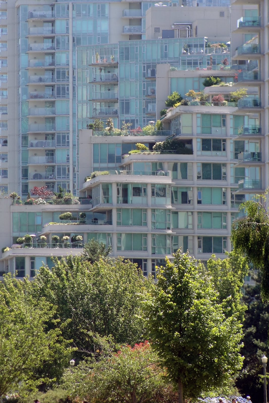
Shockingly, I am going to actually discuss buildings tonight. While my one-and-only job at the moment is being a Mom (and we're going through potty training right now, so it's an intense job), part of my heart still belongs to architecture. I spent part of my career working for a company who's main office was in Vancouver, BC. Since traveling up there for a field trip in college (related to said firm) and then for work a few times afterward, I developed a great love for the city and a great appreciation for its architecture and urban design. Through the years it has become my husband's and my favorite place to vacation even though it is a mere three hours from Seattle.The idea for this post came when we were sitting in a park on our first evening and my mother-in-law pointed out an interesting residential high rise. I looked up and realized that four years ago, I had gazed up at this same building in horror while it was under construction. I have searched high and low for the picture of it I took four years ago and I can't find it, so you just get to see the finished product, which is actually surprisingly elegant. What I saw four years ago was a huge mass of stark-gray concrete and I had no idea how it would all be finished. I remember commenting that it had surprisingly few windows. Here is the building now:This got me thinking that I have been meaning to actually write some sort of architectural critique or related post since I started this blog and this seemed like the perfect idea. So, allow me to take you on a little walking tour of some very interesting buildings in downtown Vancouver. These are mostly in the West End near Stanley Park. Here we go...(and I'll make a few comments along the way).
I like it. It makes me want to know what life in that penthouse is like. I appreciate these buildings that stray from being purely rectangular and also try to add a little bit of warmth and a residential feel. A lot of Vancouver's skysrapers are residential and I think it is a good idea to find ways of distinguishing between living and working somehow in the architecture itself. It creates a feeling of coming home as opposed to just entering another building.My mother-in-law, who was either graciously humoring my interest in these buildings, or perhaps had a genuine interest, thought this one looked like the elevator was going up the outside. That pretty much sums it up. What I thought was interesting about this building was that from this view it looks razor-thin but upon walking further down the street, I discovered the plan is actually almost triangular. The other side of the building has a completely different feel.Ugg. Call me a party-pooper, but I find "hats" and "brows" to be completely unnecessary.
This building is an ideal example of why I love Vancouver. It looks out over the water of Coal Harbor near Stanley Park, which is a gorgeous area. I absolutely love the way the building steps up creating roof gardens for each level. I can't think of a more perfect spot to live. Seriously, sign me up right now. I'm there.
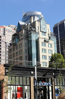
I am fairly ambivalent about this building. I only show it as an example of breaking up the rectangular monotony. I give it a shrug and an "ehh..." It does have a silly party hat, after all.
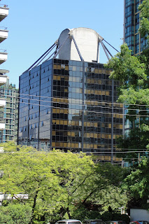
Maybe some Vancouverite can tune in and tell me exactly what the deal is with this building. I have always wondered...I just really liked the formwork of that elevator shaft. Click on the picture and zoom in to see it better. These are the things that thrill architects, what can I say? Love. It.

Cool building frame? I think so. The base of this building is another example of why I love Vancouver so much. Since the city has chosen to build tall and thin, it has created a lot of opportunities for really nice, human-scale urban design on the ground. Lots of these residential towers meet the ground with a lovely park-like atmosphere that makes being a pedestrian an absolute pleasure. This is a great example of why sometimes building up is better than building out.
...and lastly...A word or two about color and townhouses (unrelated mostly). There are a lot of really terrible townhouses in Seattle. These in Vancouver, however, are lovely, and we passed many other lovely townhouses in this vicinity of town. These are both set back from the street a little bit and are engaging at the same time. They are modern, but warm. Color. In the Pacific Northwest, we have a lot, A LOT, of gray, dark days. The sun is only up for 8 hours in the wintertime and life can feel pretty dark. I have never understood the desire to build so many gray and light blue buildings! Build with color! Warm colors! Reds, golds, earthy-tones - help us out here! We already feel damp and cold, warm us up! The company I worked for after the aforementioned one seemed to use a lot of yellow brick, which I actually appreciated, although not paired with seafoam-green curtain-wall - eek!
My final words here: if you are not an architect and don't normally notice the buildings around you, look up from time to time and form an opinion. It can be a nice conversation-starter and it can also enrich your world-view. Just ask my husband, who never notices buildings...until I point them out and make him look, that is.
So there you go. My first post about buildings. Do you want more? Tell me in the comments.
È