 | ||
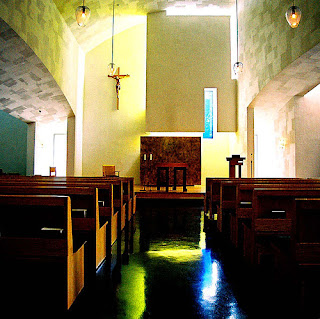
| Oh that I could take an architectural photo like this one. |
On Seattle U's campus is a very famous building designed by a famous architect who actually went to my alma mater, the University of Washington, and believe me, none of the professors ever let us forget that during school. The building is St. Ignatius Chapel and the architect is Steven Holl. I don't love all of his stuff (for example, did not like his proposal for Ground Zero), but I am very fond of this little building.
I have a thing for church-architecture. It is a fascinating genre because architects are generally given more artistic freedom, yet the obvious religious purpose of the building provides some fairly intense constraints and challenges. This creates the possibility for some serious elegance and grace (or unbelievable bad taste, as is the case of another church I intend to blog about in the future once I figure out how to get some decent pictures of it). I could actually write quite a few blog posts on interesting churches I have visited, and I have not even been abroad to see the cathedrals of Europe.
Back to St. Ignatius. It is fascinating! As stated by Holl on SU's website:
Holl conceived of the chapel as "seven bottles of light in a stone box," with each bottle or vessel of light corresponding to a focal aspect of Catholic worship. Light passes through each bottle in a specific area of the building to define physical and spiritual spaces with pools of clear and colored light.
 The outside of the building is what I will call tastefully-funky, but it completely serves the inside of the building. It is truly a case of form following function. That might be both a critique and a compliment. I can't decide because as critical as some are of the exterior of the building, I like it. It is very human-scaled and almost feels friendly as you walk by it. The exterior is also very tactile - even the glass of the windows at eye-level appear to be dimensional and it is hard not to reach out and touch them - in fact, I did. Nearly everything about this building feels unique and custom made for it.
While the interior truly is the highlight of the building's experience (as it should be with a church), there are many interesting details on the exterior of the building worth noting. Here are a couple of them:
 |
| The front door hardware. |
 |
| The front door. |
 |
| My son next to one of the custom windows. |
 The interior of the church is filled with textured
pale walls washed with very delicate and indirect, colored light. This is achieved through clear or translucent glass, oddly enough. The windows are generally up high and hidden by a baffle that has a bright color of paint on the window-side of it. The light shines through the window and bounces off of a colored wall, reflecting colored light onto very plain walls. All of the windows are different shapes, at different levels and reflecting different colors. The light changes inside the building based on both the time of day and the weather.
 |
| One of the baffles with a bright blue painted on the back. I also love the pendant lighting. You can imagine how this photo would look differently if taken at night. |
 |
| The reflection of red has a powerful effect. |
If you ever find yourself in the area (sort of where the Central District meets First hill meets Capitol Hill), take a walk past it (just north of Columbia off of 12th Avenue).
The building won an AIA award and the model permanently resides in New York City's MoMA.
For another great take on this building, go HERE.


No comments:
Post a Comment