 This got me thinking that I have been meaning to actually write some sort of architectural critique or related post since I started this blog and this seemed like the perfect idea. So, allow me to take you on a little walking tour of some very interesting buildings in downtown Vancouver. These are mostly in the West End near Stanley Park. Here we go...(and I'll make a few comments along the way).
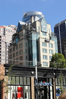
 I like it. It makes me want to know what life in that penthouse is like. I appreciate these buildings that stray from being purely rectangular and also try to add a little bit of warmth and a residential feel. A lot of Vancouver's skysrapers are residential and I think it is a good idea to find ways of distinguishing between living and working somehow in the architecture itself. It creates a feeling of coming home as opposed to just entering another building.
 My mother-in-law, who was either graciously humoring my interest in these buildings, or perhaps had a genuine interest, thought this one looked like the elevator was going up the outside. That pretty much sums it up. What I thought was interesting about this building was that from this view it looks razor-thin but upon walking further down the street, I discovered the plan is actually almost triangular. The other side of the building has a completely different feel.
 Ugg. Call me a party-pooper, but I find "hats" and "brows" to be completely unnecessary.
 This building is an ideal example of why I love Vancouver. It looks out over the water of Coal Harbor near Stanley Park, which is a gorgeous area. I absolutely love the way the building steps up creating roof gardens for each level. I can't think of a more perfect spot to live. Seriously, sign me up right now. I'm there.
 I am fairly ambivalent about this building. I only show it as an example of breaking up the rectangular monotony. I give it a shrug and an "ehh..." It does have a silly party hat, after all.
 Maybe some Vancouverite can tune in and tell me exactly what the deal is with this building. I have always wondered...
 I just really liked the formwork of that elevator shaft. Click on the picture and zoom in to see it better. These are the things that thrill architects, what can I say? Love. It.

Cool building frame? I think so. The base of this building is another example of why I love Vancouver so much. Since the city has chosen to build tall and thin, it has created a lot of opportunities for really nice, human-scale urban design on the ground. Lots of these residential towers meet the ground with a lovely park-like atmosphere that makes being a pedestrian an absolute pleasure. This is a great example of why sometimes building up is better than building out.
...and lastly...
 A word or two about color and townhouses (unrelated mostly). There are a lot of really terrible townhouses in Seattle. These in Vancouver, however, are lovely, and we passed many other lovely townhouses in this vicinity of town. These are both set back from the street a little bit and are engaging at the same time. They are modern, but warm. Color. In the Pacific Northwest, we have a lot, A LOT, of gray, dark days. The sun is only up for 8 hours in the wintertime and life can feel pretty dark. I have never understood the desire to build so many gray and light blue buildings! Build with color! Warm colors! Reds, golds, earthy-tones - help us out here! We already feel damp and cold, warm us up! The company I worked for after the aforementioned one seemed to use a lot of yellow brick, which I actually appreciated, although not paired with seafoam-green curtain-wall - eek!
My final words here: if you are not an architect and don't normally notice the buildings around you, look up from time to time and form an opinion. It can be a nice conversation-starter and it can also enrich your world-view. Just ask my husband, who never notices buildings...until I point them out and make him look, that is.
So there you go. My first post about buildings. Do you want more? Tell me in the comments.


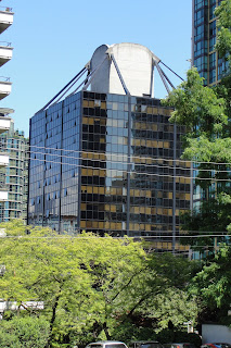
On the 'cube' building:
ReplyDeleteIt was portrayed as the "Phoenix Foundation" in the TV series, MacGyver. Fully renovated in 1990 and converted into condo in 2006.
Unique construction - it was built from the top down. The core was built first then steel was hung from cables at the top and floors were added all the way down. The first floor starts at the fourth level. Said to be highly earthquake-proof...
Known as the Westcoast Transmission Building from 1969-2000 and Duke Energy Building from 2000-2004.
Yay! I was just thinking a few days ago that you advertise "buildings" in your blog title, but haven't said anything about them yet. I enjoyed this post and will happily read anything you write on the subject. Also, I heart Vancouver too! It's one of my favorite places!
ReplyDeleteI absolutely love the design of those townhomes! So warm and friendly, yet modern and elegant. Show more fun stuff around Seattle that no one has noticed before!
ReplyDeleteI'll work on that. I have a couple of ideas I just need to get there with a camera. :)
ReplyDelete